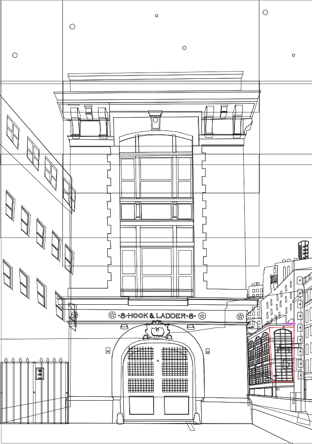
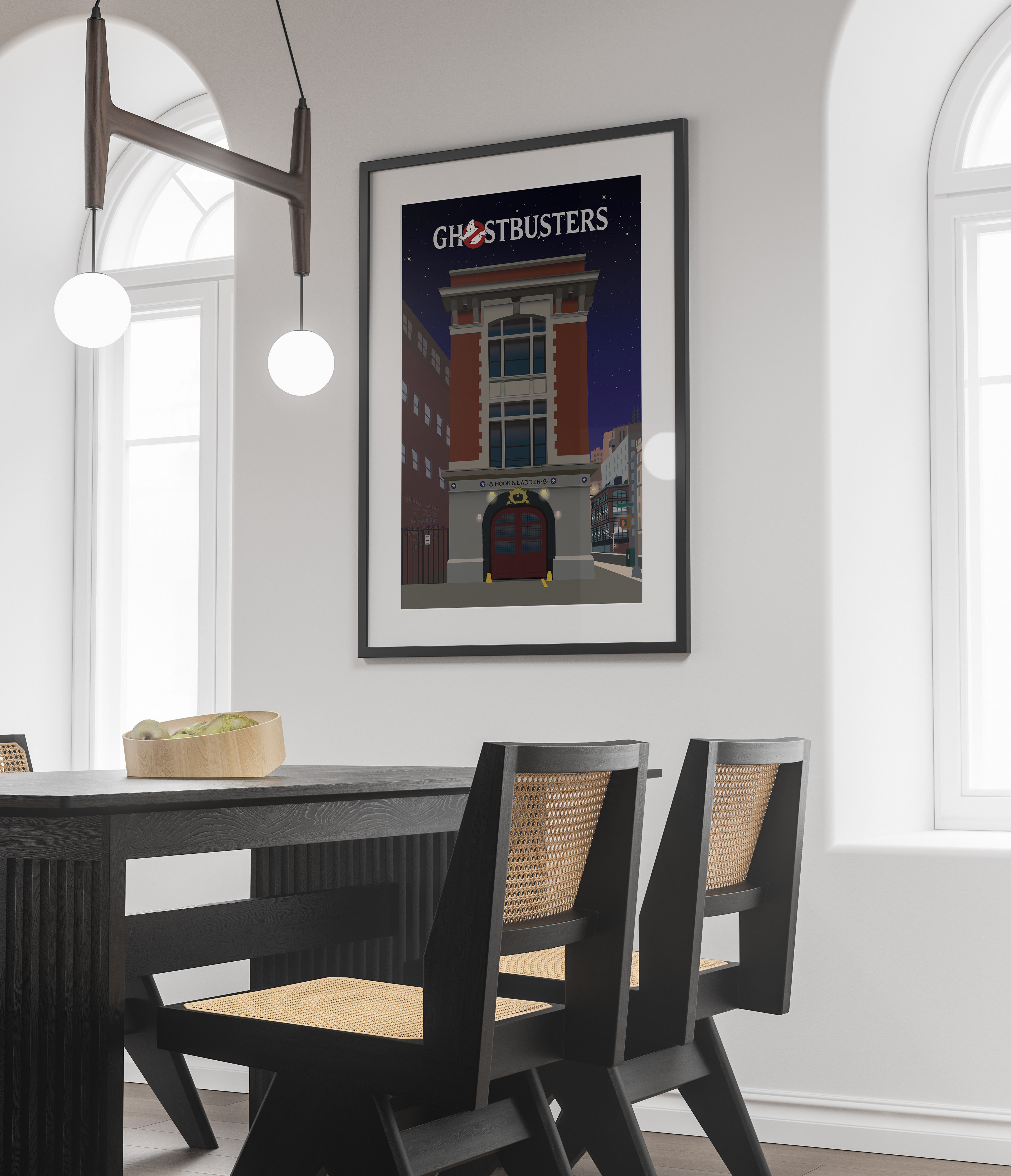
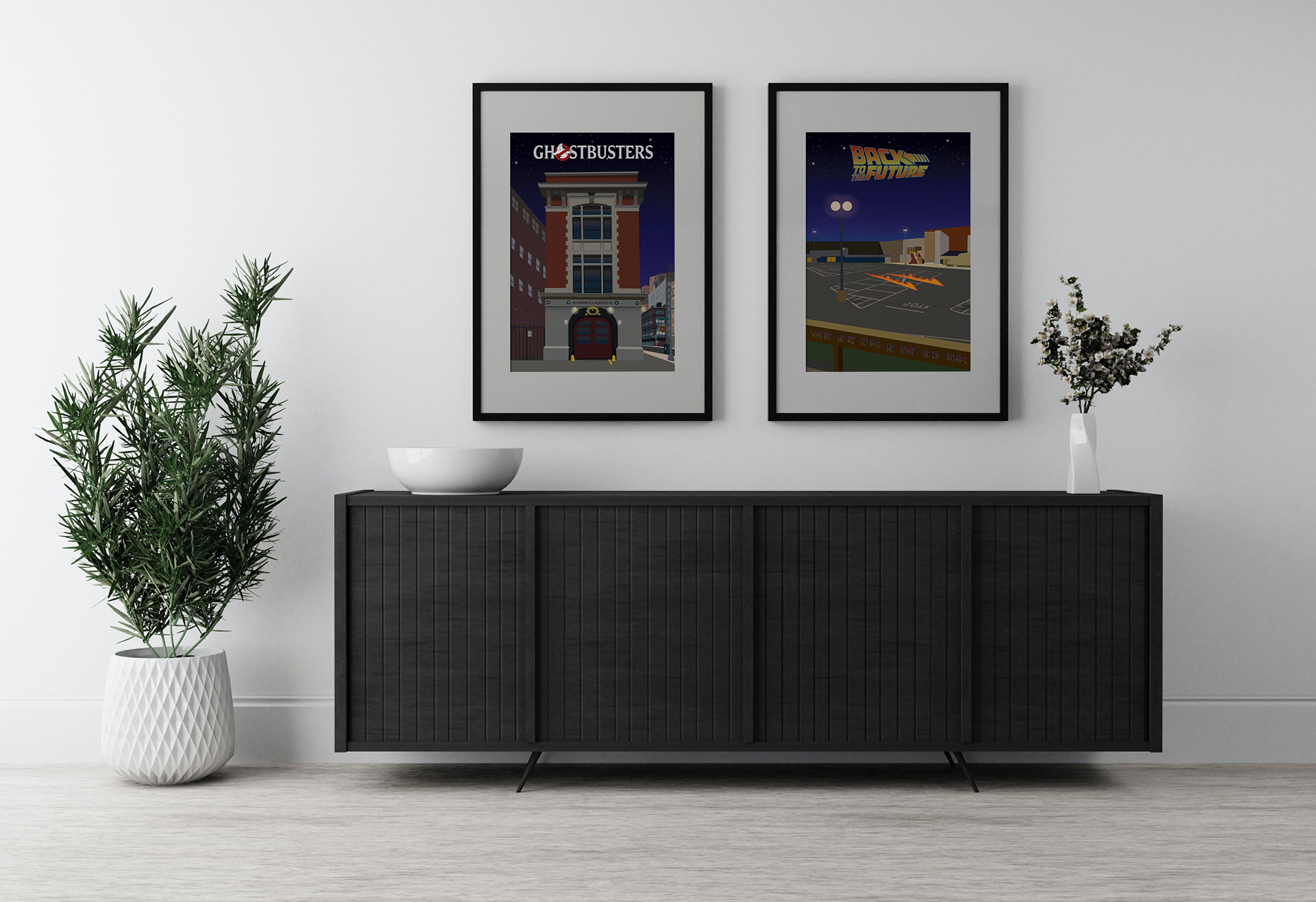
I made these posters as part of my final concrete project in my second year of design
I wanted to try and improve on areas that I found personally to be lacking, so I decided to do an illustrated poster set, themed around pop culture.
I really wanted to hit that balance between minimalistic details and shading but keeping just enough shadow details to communicate the iconic scenes.


